Statistical Process Control Can Help Treatment Plants
by D. Kelly O'Day
Water treatment plants routinely record flow, raw water quality, chemical feed, turbidity and finished water quality data. Laboratory, operations and equipment data may be collected continuously by a Supervisory Control And Data Acquisition (SCADA) system or manually recorded. Properly organized, analyzed and interpreted, this raw process data can be converted to useful information that can help plant staff to better understand process performance, identify improvement opportunities, and measure process performance improvements.
However, information on water quality, optimum dosing strategy, chemical feed system accuracy, sensor reliability and process upset patterns may be hidden in existing plant record keeping because the raw process data has not been organized and systematically analyzed.
Process Data Analysis
There area number of proven statistical process control (SPC) tools that water treatment plants can use to improve process performance. These tools can help plants by graphically showing process trends, identifying potential sensor problems, and uncovering relationships between process parameters, process train anomalies and unusual patterns.
SPC tools, used in industry since the 1920s, include trend charts, histograms, control charts and scatter charts.
Plant staff with access to a personal computer (PC) and a spreadsheet program like Microsoft Excel can use these tools to analyze their process data.
Converting Data to Useful Information
Plant staff sees fluctuations in the process data all the time, so gradual trend changes over time may not be noticeable until the net change has gotten to a point where it is greater than the normal day-to-day fluctuations. Process data lists can display raw data, but they are often difficult to interpret because gradual trends and patterns can be hidden in the list.
The first step in process data analysis is to convert the raw data into charts that can help show important trends and patterns. Trend charts show process data over time; they can help staff quickly spot systematic changes. Effective trend charts can tell plant staff if there has been a significant change in process mean or process variation over time. Has there been any significant change in finished water pH, fluoride concentration or alkalinity over the past year, month, week?
Process Variation
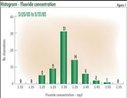
Process variability is at the center of statistical process control. Figure 1 shows an Excel histogram displaying fluoride concentration distribution. The 79 observations average 1.29 mg/l and range from a minimum of 1.13 to a maximum of 1.51 mg/l. In this case, the readings appear to have a near normally distribution.
Process variation has two elements: 1) random process variation, also called common cause variation that is inherent in the processes; 2) special cause variation caused by a specific problem or event. A process is said to be in a state of statistical control when common causes are the only source of variation. Common causes of variation are the only source of variation if the performance indicator mean and standard deviation are stable (not changing) over time, and the data is normally distributed.
Control Charts
Walter Shewhart, the Bell Labs pioneer in this discipline, developed the control chart methodology in the 1920s to help operators determine whether or not a process is in statistical control. Control charts build on trend charts by adding lines to represent process average, upper control limits (UCL) and lower control limits (LCL).
The upper control limit is the sum of the average plus 3 * standard deviation. The lower control limit is the sum of the average minus 3* standard deviation.
To be valid, the control limits should be based on a period when the process is in control. You can use an Excel histogram to check on the data distribution for the period being used to establish the control limits.
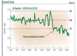
Figure 2 shows a control chart for the period 3/25 to 6/27/03. Notice the significant drop in the process mean in early June. The control chart showed that the process was "out of control" starting on 6/2/03.
Scatter Charts
Scatter charts can be used to compare one variable with another: alum dose versus sedimentation basin turbidity; plant flow rate versus finished water pH; raw water turbidity versus chlorine demand.
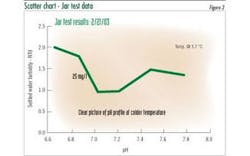
Figure 3 shows an Excel chart of jar test data, settled water pH versus settled water turbidity.
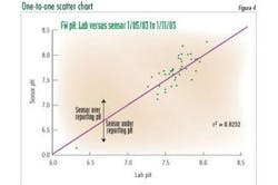
Plant operators conduct laboratory tests (pH, turbidity, chorine residuals, etc.) to verify on-line sensor reliability. A scatter chart of this routine operator test data can help plant staff monitor the accuracy of their on-line analyzers and identify analyzers that are beginning to drift.
By plotting the operator laboratory measurement on the X Axis and plotting the On-line Analyzer reading at the time of the test on the Y Axis, adding a one-to-one line on the chart, this lab data versus on-line data chart is converted to a One-to-One chart. See Figure 4. This chart shows the relationship between lab and on-line measurements and the reliability of the on-line analyzer. Measurements above the one-to-one line shows cases where the on-line analyzer is over reporting, cases below the line show cases where the analyzer is under reporting.
Correlation coefficient is a measure of the relation between two or more variables. Regression analysis can be used to develop a formula that "predicts" one dependent process variable given one or more independent process variables. Together, correlation and regression analysis can be used to analyze historical process data to better understand process performance.
Correlation coefficients (r) or coefficient of determination (r2) provide a direct measure of the strength of the relationship between two variables.
Excel provides the capabilities to determine the correlation coefficient and determine the 'best fit" least-squares regression between two or more variables.
Making Charts in Excel
Making a chart in Excel is very simple; it can be done in several steps:
1. Select data to be charted
2. Press the chart wizard icon ( )
3. Proceed through the 4 Chart Wizard Steps.
- Step 1: Select Chart Type
- Step 2: Specify source data
- Step 3: Chart Options
- Step 4: Chart Location
Excel charts can look either amateurish or professional, depending on how the user adjusts the defaults. Professional charts focus on the data.
Editor's Note: The author will provide, at no charge, a practical spreadsheet in MS Excel that includes sample data for the charts in this article, and provides additional details on how plant engineers and others can make these calculations for their facilities. To receive this Excel document in email, send a request on your organization's email system, to [email protected].
About the Author: D. Kelly O'Day is a Vice President with Woodard & Curran, Dedham, MA, who specializes in helping water and wastewater treatment plants optimize operations. He formerly was Director of Water Operations for the Massachusetts Water Resources Authority.
